Rentl
Car rentals made simple
OVERVIEW
Software in the rental car space is in need of a refresh. Users made it clear that the software available was cumbersome, the flow confusing, and screen space dominated by legal terms and conditions.
Rentl addresses these pain points. With a foundation in user research and analysis, this app minimises the steps from start to checkout and makes the user journey frictionless.
ROLE
UX Designer • UI Designer
User Research, Interaction, Visual design, Prototyping & Testing
Summer 2023
COMPETITIVE BENCHMARKING
Reviewing the market allowed me to experience the process and familiarise myself with the industry conventions.
Analysis of the big players in the car and van rental space highlighted a lot of problems. Companies considered household names had less than stellar applications - with confusing layouts, iconography, and technical terms not familiar to anyone, let alone car enthusiasts.
The home screens of competitor apps.
INTERVIEWS & QUESTIONAIRES
My opinion is all well and good, but not that relevant. What do actual users think of the current rental apps on offer?
A range of usability tests and questionnaires followed to help highlight the points of friction the typical user experiences, and to see for myself the frustrations encountered.
These interviews ranged from online surveys, face to face interviews and observations of a rental app in use.
Sample responses of the online survey.
Screenshot of a participant in a usability test.
QUALITIVE COMMENTARY
A sample of some of the pain-points encountered during usability testing on a mobile application.
“I’m not sure where I find filters to find automatic cars. I really don’t want to do this much looking. Is it on the search screen?”
“Where do I put the drop-off location? Have I already done this? I’m confused”
“There are a lot of technical terms here. I’m not really a car person, not really sure what these mean. Usually I just get my partner to help. ”
“There is a lot of text here. I guess these are the T&Cs? It it taking up the whole screen. ”
User quotes during interviews
AFFINITY DIAGRAM
The competitive analysis, user interviews, observations and questionnaires created a stack of great insights - both qualitative and quantitive. The next step was to group these together by their natural relationships to get to the root of the findings. The tool used here was the Infinity Diagram (or KJ method) with input from other designers.
Each insight (regardless of positive, negative or neutral) is written onto a post it and placed on a wall, then via discussion with others, the post its can be grouped by their overlapping characteristics e.g. Visual look and feel, search results and filtering.
The process was originally handwritten on post-its, then digitised using Miro - allowing collaborators working remotely to get involved.
Post-its and my office wall.
Completed Infinity Diagram
CUSTOMER JOURNEY MAP
The customer journey map is a great way of defining the high-level steps taken by a typical user from start to check-out. This map is a direct follow on from the Infinity Diagram produced.
For each step, the users goals, positive interactions, pain-points and potential drop-out areas can be defined and with that a ranking how positive overall the experience has been.
This is not a mathematical document, and some subjectivity remains. However the document gave me a great overview of the key touch points in the user journey and can high light the areas in which the developed product can outperform competitors.
Customer Journey Map
USER FLOW
The next stage was to define the typical high levels flows of a user through the app. The user journey shown below details the progression of a typical user opening the app, to finishing payment. Each screen state is marked as a white box. Each choice or interaction is defined by a green box. The direction of flow is indicated by the arrows.
Using the diagram, each screen state can be planned and the interactions between screens defined before designing can begin.
User Journey of a happy flow from Home Screen to checkout .
LOW FIDELITY PROTOTYPING
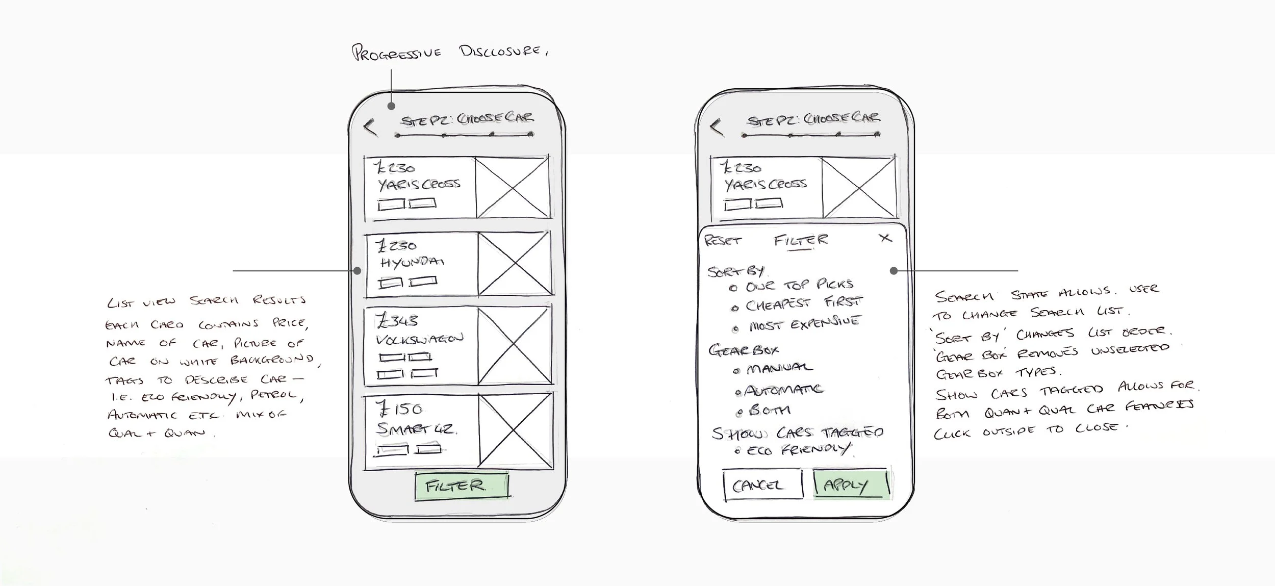
A series of sketches were developed to flesh out the fundamental design of the Rentl app. The sketches were fast and loose with a focus on highlighting design elements that would work well and eliminating those that won’t when moving onto the medium and high fidelity designs.
Working with pens and paper allowed for changes quickly and effortlessly - which would be more time consuming in later stages of design.


MEDIUM FIDELITY PROTOTYPING
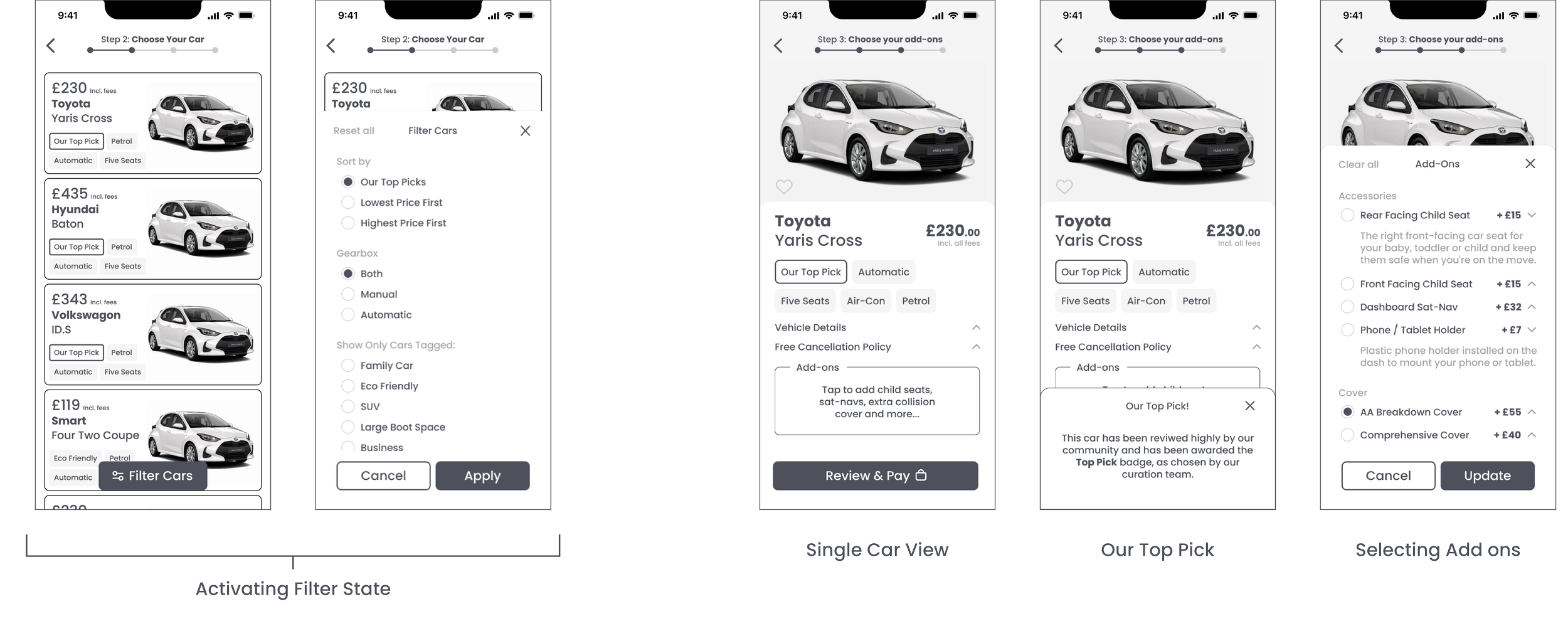
Next up, wireframes. Medium fidelity prototypes were developed in Figma to test the concepts developed are understandable and intuitive to users.
The user research highlighted two key areas of friction with competitior’s products: filtering search results and navigating add ons / upsells. Below is the wireframe with the solutions to these pain points addressed.


QUALITATIVE SEARCHING
One of the first issues highlighted in the user research is the inability to search for cars with both qualitative and quantitive features. Rentl solves this with the tagging feature. Need to order the search so only automatic cars are shown? No problem, select the filters button and click Automatic.
What about something more subjective, for example a family friendly car? Easy. Filter your results for cars tagged Family Car and that’s all you’ll be shown.
Each vehicle in the search results is tagged with key features, such as Eco-Friendly or Business Travellers, alongside the more quantitive features - such as gearbox type or no. seats available.
Our Top Picks allows the platform to add search hierarchy to vehicles the company wishes to promote.
ADD-ONS (1)
Another point of friction highlighted during competitive analysis and user testing was add-ons. Users we presented with a series of incoherant images and text, littered with technical terms, for purchase extras (such as child-seats or extra collision cover).
Rentl bakes this process into the slected-car view, rather than a jarring additional forced step between reserving the vehicle and reviewing the details.
Specific details about the add-ons are hidden behind a drop-down, for more complex features however, extra info is just a tap away and does not disrupt the user flow.
ADD-ONS (2)
The user has the ability to purchase multiple add-ons. The container on the selected vehicle page adjusts depending on the amount of add-ons selected and turns the page scrollable once 4 or more are included.
The price given is also updated to reflect and extras added. The complete overview of the chosen car in contained inside one screen.
Shown right: the vehicle select screen with 2 and 5 add-ons applied (white circle is placeholder icon).
TESTING THE FLOW
With an interactive prototype ready, testing can begin with a series of test participants. Users unfamiliar with the app were given tasks to complete with the new software and the results documented.
From user feedback, the following points we raised and the design adapted before moving into the next stage of the process:
A breakdown of the total price is needed on the review page and driver details is not needed.
Inputting dates needs an accent colour to show the the days booked.
Searching needs check boxes where multiple options can be selected.
HIGH FIDELITY PROTOTYPE
With the design flow at a MVP stage, the visual aesthetics was polished. Drop shadows, accent colours and layouts were added and spacing and padding was tidied up.
Want to check out the Figma file yourself?
https://www.figma.com/file/ZPjsrhzT6HboMofkgdEH64/Rentl-Mobile-App?type=design&node-id=0%3A1&mode=design&t=o3OvSxcDAeQsmEZi-1
THE NEXT STEPS
Given more time, more usability testing would take place to further identify places within the process user friction occurs. There is potential to improve the add-ons screen. A set of consistent iconography could be developed - something rival rental apps have struggled with. The account settings and review trips page can also be developed.


